
The RCM Dashboard application (App) consists of five “sheets”:
- RCM Progress
- Failure Mode Detail
- Mitigation Task Detail
- Criticality Analysis, and
- Knowledge Management
The following explanations will help you to begin using the visualization objects of each sheet. Each object (chart or table) can be expanded to full screen using the double arrow icon on its top right corner. Filters you set up will apply to all sheets until you clear them.
1. RCM Progress
 The RCM Progress dashboard contains 9 visualization objects:
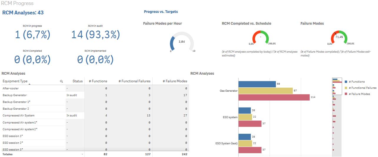
- RCM in progress
- RCM in audit
- RCM completed
- RCM implemented
- Failure modes per hour
- RCM completed vs schedule
- Failure modes
- RCM Analyses (Table of #Functions, Failures, Failure Modes by equipment type)
- RCM Analyses (Bar chart of #Functions, Failures, Failure Modes by equipment type)
To read this dashboard, select an equipment type[1]. The selection is called a “filter”. Create your filter by selecting one or more equipment types from the RCM Analyses table. All the objects immediately reflect the item or items selected in the filter. Your filter appears in the top dark bar, for example the filter “FLEET_NAME”. Add or subtract items in the filter by clicking them in an object. Remove a filter by “X”ing it out on the top brown filter bar
RCM in progress, RCM in audit, RCM Completed, RCM Implemented
 By clearing the filter RCM Analyses will indicate the number of Analyses identified in Mesh, RCM in progress will tell you the number and percentage of total of RCM analyses that are currently in progress, and RCM Completed will tell you the number and percentage of RCM analyses that are currently completed the audit stage but not yet implemented.
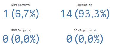
Failure Modes per Hour
 This horseshoe graph indicates the skill of the analysts and facilitator. It is considered the most important KPI for judging an organization’s ability to perform initial RCM efficiently. The RCM efficiency KPI target is between 5 and 6 Exclude the analyses that are “In progress” from the filter. Compare performance among different asset types to gain an appreciation of overall organizational RCM ability.
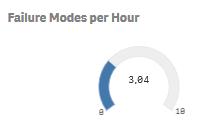
RCM completed v.s. scheduled
 A KPI measuring compliance with schedule. The data for this graph is provided by the RCM coordinator or facilitator on a Excel spreadsheet. That information is then automatically combined with the data from Mesh to determine the progress of the RCM project against the target scheule. An example of the Excel sheet provided can be seen here.
Failure Modes actual vs estimated
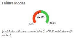 Actual v.s. number of failure modes estimated for an equipment type at RCM project planning phase. This KPI measures the skill of the facilitator in assessing, during the RCM planning phase, the number of failure modes that will need to be documented during the analysis.
The facilitator combines this with the “Failure modes per hour” KPI in order to estimate the number of RCM sessions needed to perform the analysis. He then uses his estimate to schedule the SMEs and locations for the analysis sessions.
RCM Analyses – Table
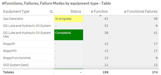 This table lists the equipment types identified in Mesh for RCM analysis. The table can be used as a filter to home in on one or more specific equipment types. The filter remains active for all other visualization objects in the App. The number of Functions, Failures, and Failure Modes can be read from the table.
RCM Analyses – Bar chart
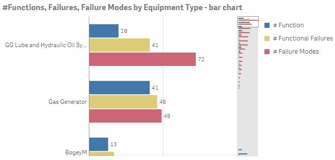 The same information as the table above but presented visually as a bar chart.
The chart on the right shows, as you scroll vertically, the current view in the context of the entire filtered sample.
2. Failure Mode detail
Failure mode grouped by consequences
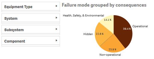 Use the filters on the left to select a physical item for failure mode examination. The pie chart breaks down the a filtered combination of Equipment, Systems, and Components by consequence (Hidden, HSE, Operational, Non-operational)
The chart itself can be used to filter the other displays.
Expected corrective v.s. mitigating time by equipment type
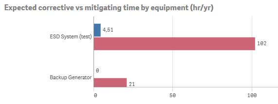 This bar chart uses three data sources in Mesh:
- The estimated corrective downtime in hours per failure instance
- The probability in instances per year from the risk (criticality) analysis in the knowledge base, and
- The mitigation time in hours and frequency (in times/year)
The blue and purple bars per equipment type compare yearly proactive (mitigating) effort with expected worst case reactive effort (i.e. no PM). These results can be filtered down (using the Failure mode detail table described next) to the failure mode level in order to examine the expected benefits related to specific PM tasks and frequencies.
Failure mode detail table
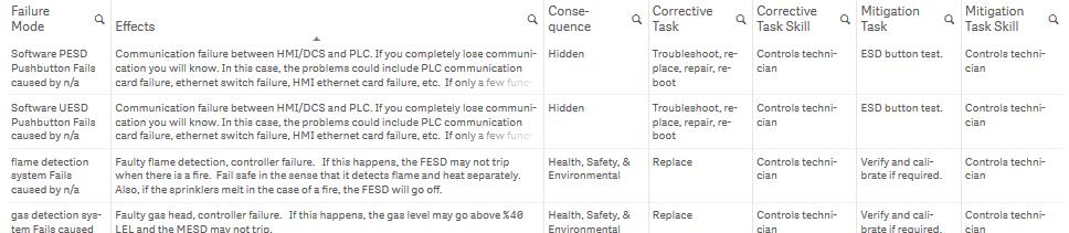 This table displays the details related to each failure mode identified in Mesh. The full text of, for example the Effects analysis is displayed by hovering the mouse pointer over any cell. The Equipment filter may be refined by selecting one or more failure modes in this table.
3. Mitigation task detail
Tasks grouped by mitigating type
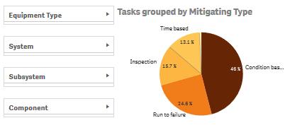 As in all sheets, we can apply a filter to combinations of physical assets and their respective systems and subsystems. The Tasks grouped by mitigating type pie chart will display the planned relative effort (%time) to be applied in each task category.
Expected corrective vs mitigating time by failure mode table
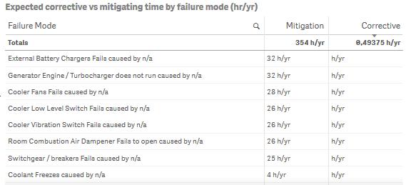 We can further examine one or more failure modes by comparing their proactive and expected reactive efforts. The Reactive (Corrective) effort is drawn from the criticality analysis data source. This analysis could help in adjusting mitigating tasks and frequencies to arrive at acceptable risk.
Tasks grouped by frequency and skill
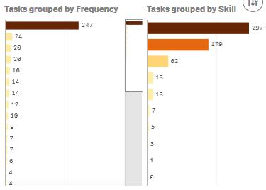 Setting up maintenance schedules requires this data, which can be exported directly from the visualization object.
By filtering on frequency and skill you can export to Excel any or all of the individual maintenance schedules (PM task sheets) for upload to the EAM.
Mitigating tasks
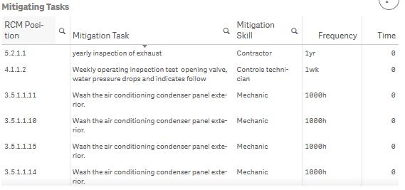 According to any filter criteria the tasks for developing maintenance schedules are displayed along with their reference number designating their positions within the RCM knowledge hierarchy.
4. Criticality analysis
Criticality by failure mode table
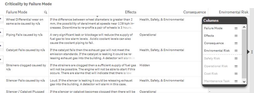 Criticality analysis is considered an important maintenance information function in the oil and gas sector (particularly off-shore installations). The data source is is the risk analysis performed in Mesh knowledge builder [2]. Mesh provides user configurable selection grids for the probability and severity of a failure mode in various categories (e.g. Cost, Safety, Environment Operations). Criticality analysis should be carried out for any failure mode only after its RCM Effects analysis has been completed, which will ensure that the quantitative analysis is based on SME consensus.[3]
Failure mode risks bar chart
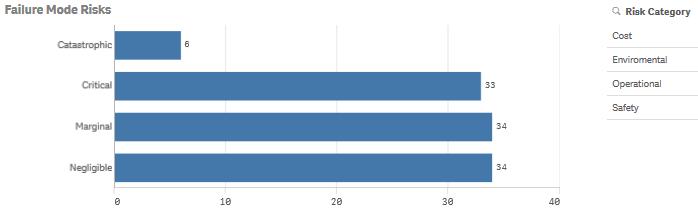 Quantitative risk levels are calculated according to the user configurable formula and tables in Mesh. Various industries and organizations may apply their own standards for setting up severity and probability categories. Mesh will accommodate any Criticality standard.
5. Knowledge management
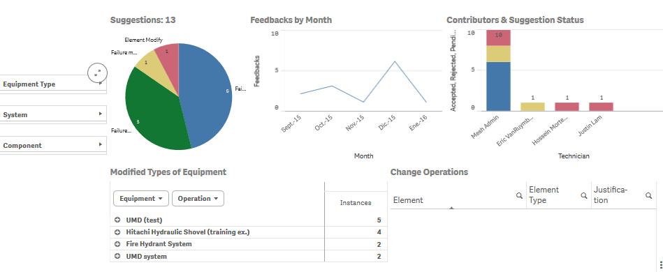 Knowledge management is the process by which the RCM analysis is continuously updated as new experience and new insight is gathered day to day within the work order system. The Mesh feedback system is the tool used to make knowledge suggestions and comments. The visualization objects in this sheet are designed to measure and assess the knowledge related activity conducted via the Mesh feedback system. The feedback system is the recommended tool by which RCM auditors may examine, question, and finally sign off on each RCM analysis.
See, creating a story on page 2
© 2016, Murray Wiseman. All rights reserved.
- [1]An equipment type/fleet is equivalent to a unit or specific asset where it is a one-of a-type-asset. RCM analysis is performed for an equipment type. class or model. But it applies to all units of that type.↩
- [2]The “Risk” tab of the Failure Mode data entry dialog↩
- [3]Performing the risk analysis without having performed the RCM effects analysis is not advisable as it will often result in criticality numbers not supported by the SME consensus.↩
- Measuring and Improving CBM Effectiveness (73.1%)
- EXAKT cost sensitivity analysis (73.1%)
- Structured free text (55.2%)
- Templates for speeding up RCM (54%)
- Performance metrics - Low and High level KPIs (46%)
- LRCM at Cerrejon (RANDOM - 9.2%)
In the “RCM completed vs scheduled” horseshoe chart, 0% and 200% , qualitative labels ( Behind schedule, Ahead of schedule) were added.
Only failure modes of systems whose status is “completed”, “in audit, or “implemented” are considered in the “Failure modes” horseshoe chart.
A link was added to each dashboard that takes the user into the explanatory notes.