Dashboards provide views of knowledge and data about the physical assets whose performance is to be maintained. The dashboards tell you how well you are doing with regard performance goals. Dashboards reveal the issues requiring your attention.
Maintenance strategy dashboard
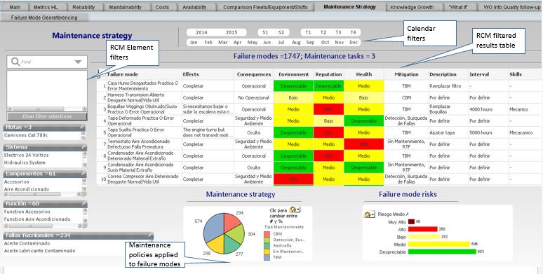
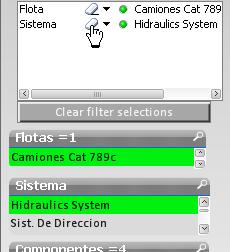
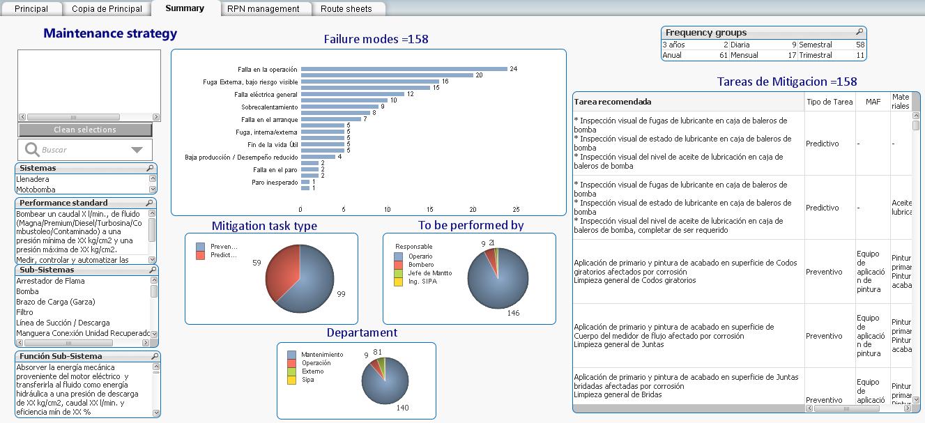
Once an initial RCM analysis has been completed the Maintenance Strategy dashboard (tab) will provide a variety of views of the RCM knowledge base and the risk mitigating policies derived from it. On the left are the filters for selecting combinations of RCM hierarchical elements, for example: Fleets, Systems, Components, Functions, and Failures. As each selection is made it is added to the filter. In this example there are three fleets to choose from. We’ll use the Maintenance Strategy dashboard to examine the RCM analysis that was conducted for the each of the fleets of Trucks (Camiones).
Select a Fleet (type of equipment)
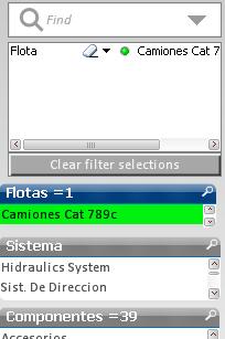
Each selection you make stays highlighted until you erase the selection in the selection box or hit “Clear filter selections”.
You can make as many selections as you wish and each will appear in the filter list. The filter that you create will determine the results shown in all other views on the current dashboard as well as in the other dashboards (tabs).
Select a system
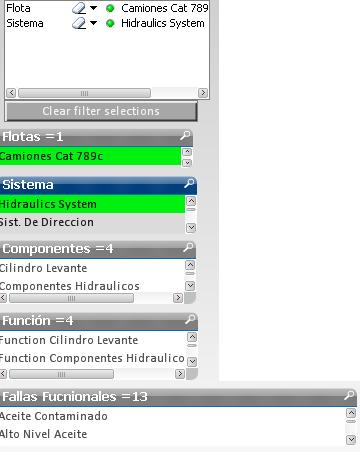
As you make a selection, the number of choices in the lower elements of the RCM tree narrow down to only those that apply. For example, with Trucks selected, now make a selection from Systems, say Hydraulic System.
Note that there are four components in the Hydraulic system having a total of 4 Functions and thirteen Failures.
How many Failure Modes does the Hydraulic System have? To find out we shift our attention to the large table containing the RCM analysis and results.
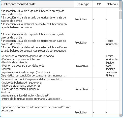
RCM table
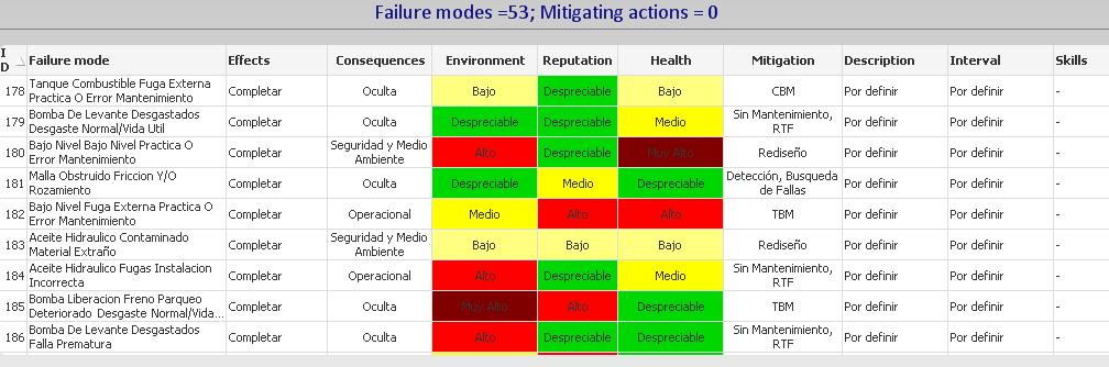
We see in the title of the table of Slide 4 that for the Truck-Hydraulic system filter there are 53 Failure modes but no specific mitigating task descriptions have yet been applied. The the table lists the failure modes along with their respective Effects, Consequences, Mitigation tasks, Task descriptions, Intervals, and Skills. This is a useful tabular view of the entire RCM knowledge base consistent with the SAE JA1011 1999 standard and with the old style worksheets of manual RCM analysis procedures.
Erase a filter
Now remove the filter selection Hydraulic System. Notice that the RCM table now lists 492 Failure modes and 3 Mitigating actions. The table now includes the entire set of knowledge from the RCM analysis of the Truck fleet (Camiones Cat 789c).
Maintenance policies pie chart
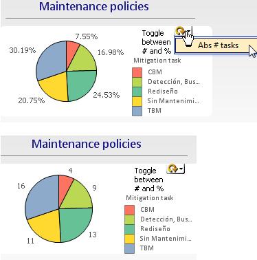
The pie chart presents a quick visual summary of how the failure modes of the filtered selection are distributed among (i.e. grouped by) the 5 types of mitigating activities: CBM, TBM, Detection (i.e. failure finding), No Scheduled Maintenance (NSM), and Redesign.
The circular toggle switch toggles the pie chart dimensions between absolute between percent and absolute number of failure modes in each category. For example, the charts show that the Truck maintenance strategy consists of 7.55% (or 4 absolute number) CBM tasks. If the target were higher, say 25 CBM, we could see where we are with respect to attaining the goal. For any given performance indicator, dashboards provide a visual check of the current gaps with respect to any performance indicators that a manager has set for his organization.
Risks by failure mode
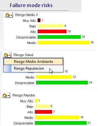
The bar chart on the dashboard’s bottom right lets us to delve into the risks as determined by the RCM analysts associated with each failure mode.
Toggle among the types of risk: Health / Safety / Environmental (HSE), Reputation (customer service).
Drill down into the high risk to customer service
 Which failure single mode is responsible for creating a high customer service risk which would tarnish the organization’s good will and reputation?
Click on the bar “Very high” (Muy alto).
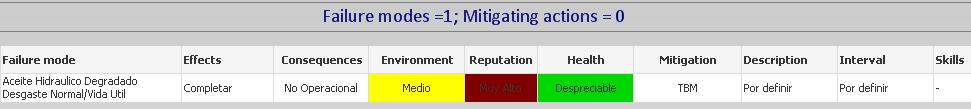
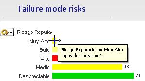
We have drilled to the offending failure mode and display the complete available RCM record related to the failure mode in question. We note that no specific task has yet been defined to mitigate the consequences. A high risk to reputation would translate to “Operational” rather than “Non-operational” consequences. The Effects have not been described, which could account for the error in correctly designating the the Consequences. Hence the reliability engineer should correct this inaccuracy in the knowledge base. The dashboard is helpful in managing risk and identifying quickly any inadequacies in the maintenance strategy.
Work packages
When the initial RCM analysis is complete the tasks need to be organized into work packages. The dashboard illustrated below will assist in gathering tasks that can be done at the same time.
Filter to a system of interest
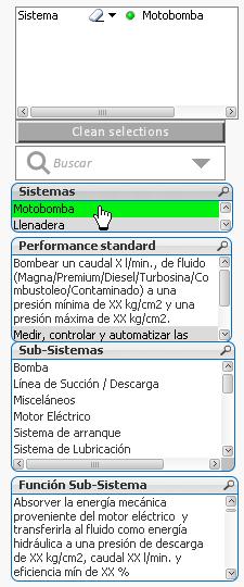 Select the system Motor Pump (motobomba). The structure of this knowledge base differs from that of the previous example. However the principles of work package organization apply in the same way.
Note that the Performance Standards that apply to the Motor Pump are listed, as well as the Sub-systems and Functions that apply to the entire system.
Failure Modes
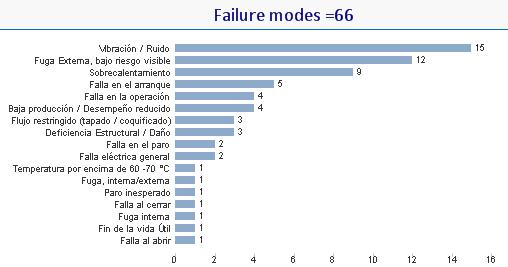 In this example’s knowledge structure the Failure Modes are defined[1] by short expressions, for example, “Vibration / Noise (Vibracion / Ruida), “External Leak” (Fuga Externa), and so on. The bar chart indicates 66 failure modes in descending frequency according to their categories, the most frequent (15 instances) of the vibration and noise category.
RCM mitigating tasks
 Having filtered on the entire Motor- Pump system the 66 tasks are listed in the Mitigating tasks table. The task description, task type, manpower, and materials required are shown in their respective columns.
Filter on each task frequency
 Select each of the filter items in the Frequency groups table to list the candidate tasks for a reasonable task package.
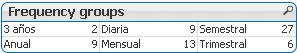
Select a frequency
The 3 year task frequency group is illustrated to the right. Two tasks remain the the Mitigating tasks table to be performed at the 3 year interval.
Tasks by failure mode
 The categories of the two 3-year tasks are shown in the bar chart. The length of each bar indicates the number of tasks in the category to be performed at a three year interval.
Tasks by type, performed by, and department
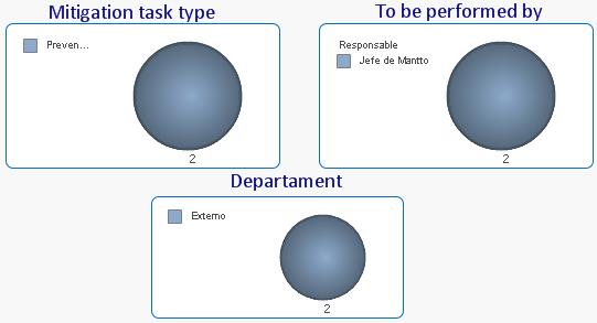 The breakdown of the two tasks in terms of Mitigation task type, To be performed by, and Department are given in the three pie charts respectively as illustrated.
You may select different filtered combinations systems, sub-systems, and frequencies to see their effects on the charts and tables or to accommodate the work packages to the physical plant geography.
Risk management
Switch to the RPN (risk priority number) management dashboard (tab)
Filter
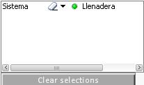 Clear the previous filter selections and select the Filling Stations (Llenadera) system.
Failure mode (quantities) by RPN
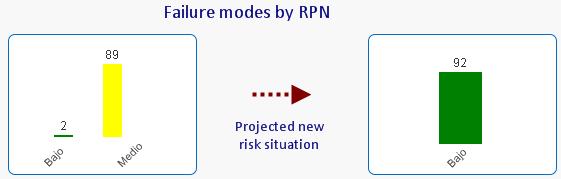 In the bar chart on the left side of the image there were originally 89 failure modes that have a “medium” risk and 2 were assessed as “low” risk. After the initial RCM analysis as a result of the risk mitigating tasks, the new risk assessment is shown on the right side bar chart. Although these charts represent judgment of risk by the analysts, the dashboards nevertheless provide a performance indicator on RCM knowledge base improvement because they reflect the refinement of the Effects, Consequences, and Mitigating tasks. The LRCM structure allows comparison of risks in this way between any two calendar periods. Later on we’ll examine other dashboards that show actual reliability performance evolution in response to the maintenance organization’s continuous improvement efforts.
Failure modes (individual descriptions) by RPN
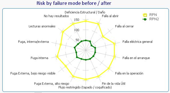 The failure modes are arranged in a radar (or spider web) diagram. The outer yellow line represents the original (prior to setting the mitigating action) “high” risk assessment for each failure mode while the green represents the “after RCM” individual failure mode risk assessments.
Failure modes and their mitigating tasks
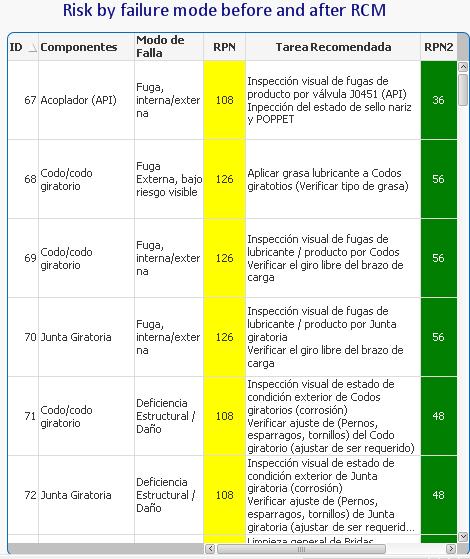 The final element of this risk management dashboard displays a table of failure modes corresponding to the filter selection for the “Filling stations” system. We can easily verify the analysts “before” assessments of risk and the mitigating task chosen to reduce the risk to the “after” value.
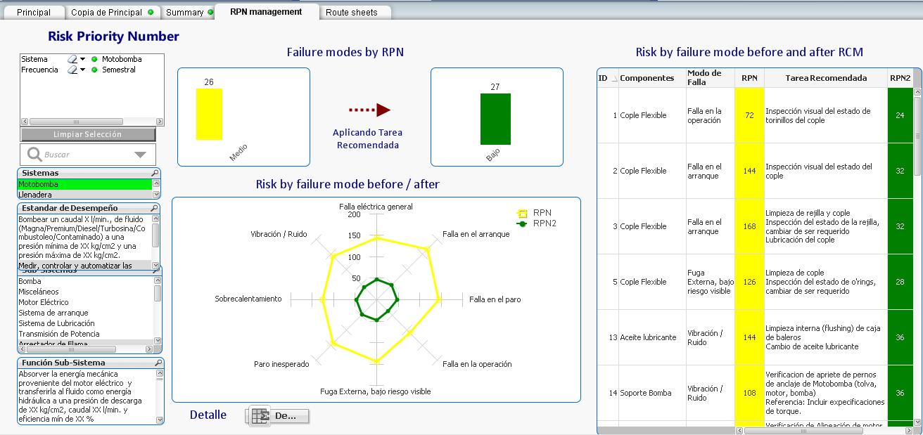
RPN assessment detail
Double click the detailed risk analysis button.
Detailed risk analysis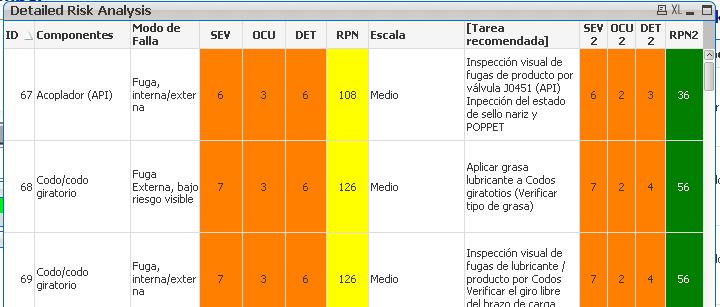
The Detailed Risk Analysis table appears. It is the same as the previous table except that additional columns detailing the RPN breakdowns (before and after) into Severity (SEV), Frequency of occurrence (OCU) and Detection/prediction ability (DET). [2]
Route sheets
Switch to the Route sheets dashboard.
Route sheets cover the PM activities, which in this exercise are categorized as either “Preventive” or “Predictive”. Route sheets are another way of looking at the RCM mitigating tasks. They differ from the Work Packages discussed earlier, in that they usually transcend equipment boundaries. For example a vibration analyst technician would travel along a daily route of different equipment at different locations across the facility.
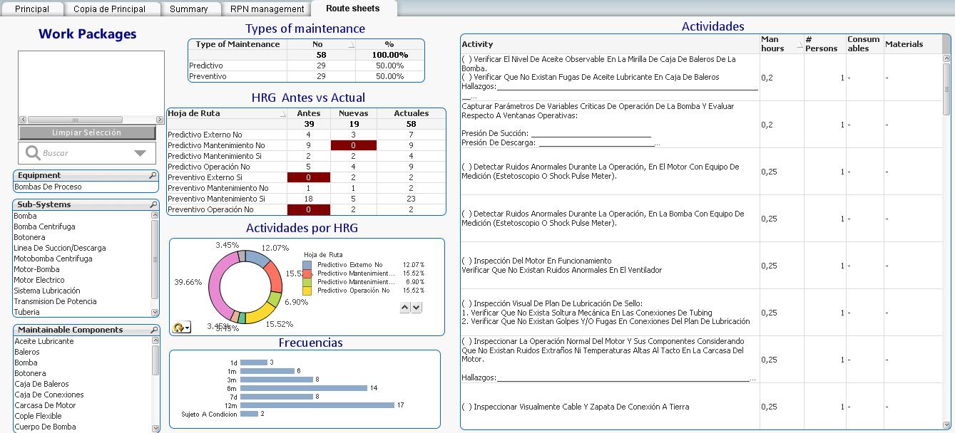
Types of maintenance
 The “Types of maintenance” table provides the breakdown between Predictive and Preventive tasks. Many maintenance experts feel that maintenance strategies should evolve from TBM towards CBM activities. This would be the rationale for this breakdown. You can click on either Predictive or Preventive in this table to filter the information in the subsequent displays.
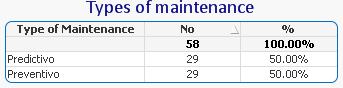
Route sheets before and after
 In this table each of 8 route sheets, 4 predictive and 4 preventive, is shown with their original number of tasks, the number of tasks added by RCM, and the new totals.
You can click on any route sheet in this table to filter the information in the subsequent displays.
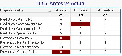
Relative size of the route sheets
 We can have a view of the balance of activities among the 8 route sheets. Hit the circular arrow icon to switch from percentage to absolute number of tasks.
You can click on any item in the legend or graph to filter the results for that route sheet.
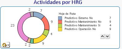
Task breakdown by frequency
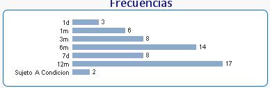 The 58 tasks are broken down in this bar chart by their frequencies. We can display the results on the bar chart for any one or more route sheets by clicking on the desired elements of any table, chart or graph.
Activities list
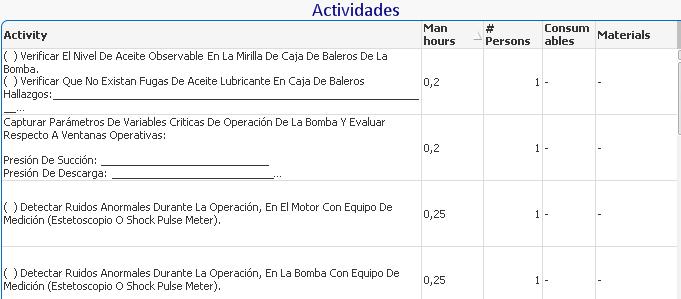 The detailed activities, Man hours, Number of persons, Consumables, and Materials are shown in this table for the worksheets selected in the various filters of the previous elements. You can filter backwards by clicking on any of the activities to see see the effect on the previous displays.
LRCM knowledge feedback dashboards
Switch to the Knowledge Growth dashboard (tab)
Suggestion types
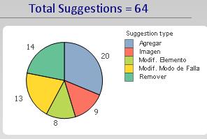 The Suggestion type pie chart displays the breakdown according to whether an RCM element was added, an image was added, an element was modified, a failure mode was modified, or an element was removed.
As usual, any element of the chart is a filter.
Suggestions by month
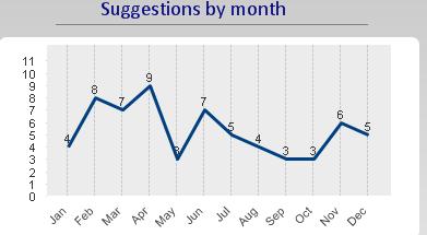 This graph can be displayed for any of the filters, even down to the suggestions by an individual. As the knowledge base improves we would expect this line graph to trend downwards with the removal of the most obvious errors and gaps in the knowledge base.
Suggestion status by contributor
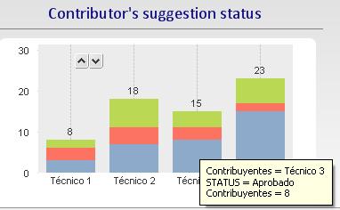 This bar chart displays individual contributions to the RCM knowledge base. Using the LRCM work order interface, every work order becomes an opportunity to improve the information, knowledge, and mitigation strategies as they are documented in the RCM repository.
Tool tips identify the number of feedback suggestions and their status, whether they have been approved, awaiting approval, or rejected. An employee may be named “Knowledge contributor of the Month” and receive a tee shirt or a meal as an expression of appreciation by management.
Each element of the chart is also a filter, to drill down to the actual suggestions.
Knowledge suggestion turnaround time
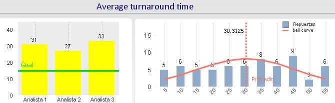 The bar chart on the left displays the average performance by a Reliability Analyst or engineer responsible for processing RCM knowledge suggestions received, via the MESH LRCM feedback system, from the technicians. The goal of 15 days is indicated on the chart.
The chart on the left is a histogram indicating the turnaround time distribution. For example in this display, for all three Analysts, 5 suggestions were processed within 5 days 6 were processed from between 6 and 10 days, and so on. A suggestion, on average takes 30 days to turn around.
High level (lagging) KPIs
Switch to the Metrics HL dashboard (tab).
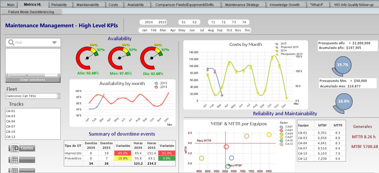
All managers aim to find the relationship between low level KPIs that measure the results of day-to-day employee activities and high level KPIs that relate directly to shareholder value and enterprise profitability. What behaviors and activities should a manager encourage? Up to now measured in a variety of low level KPIs using graphs, charts an tables that the manager believes are conducive to ultimate enterprise performance. The combination of low and high level dashboards presented here intend to establish that relationship more concretely. With the aid of the dashboards the manager would more confidently direct his team to achieving the low level goals that he has set set, knowing that they will support specific business goals, such as high availability described next.
Availability
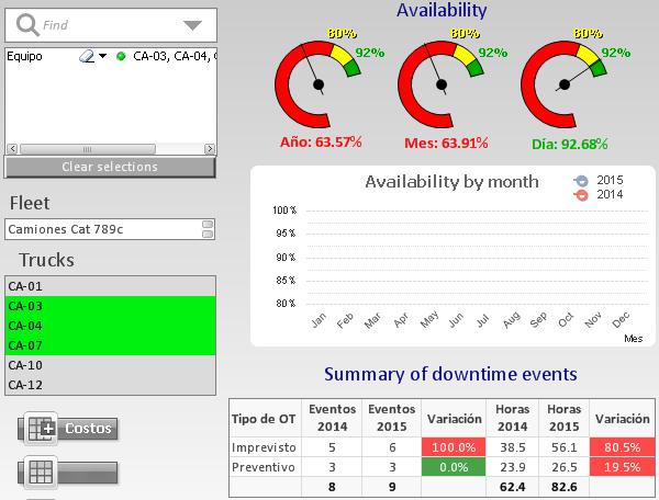 The charts show the combined availability in different forms for the three specified trucks of the Cat 789 fleet. The calendar selections can filter on year, month, trimester and even on shift so as to compare performance at different times and context.
The table “Summary of downtime events” breaks the d/t events in two categories planned (Preventivo) and unplanned (Imprevisto). The years can be compared as to number of events and hours.
Costs by month
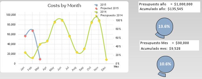 For the various filter selections the cost by month are graphed.
The projected annual costs are $1000000 and 13.5% has been consumed as of March. Similar results are shown for the current month.
MTTR and MTBF
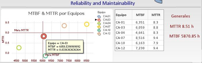 The dispersion graph shown here can be used to identify problem trucks and make decisions as to which should be prioritized for overhaul or replacement. As with all charts selecting a given token on the chart, displays the relevant information. This view highlights the most critical equipment. Those that fall in the top left quadrant would be in the most urgent need of attention given their low reliability (MTBF) and high MTTR.
Reliability
Switch to the Reliability dashboard.
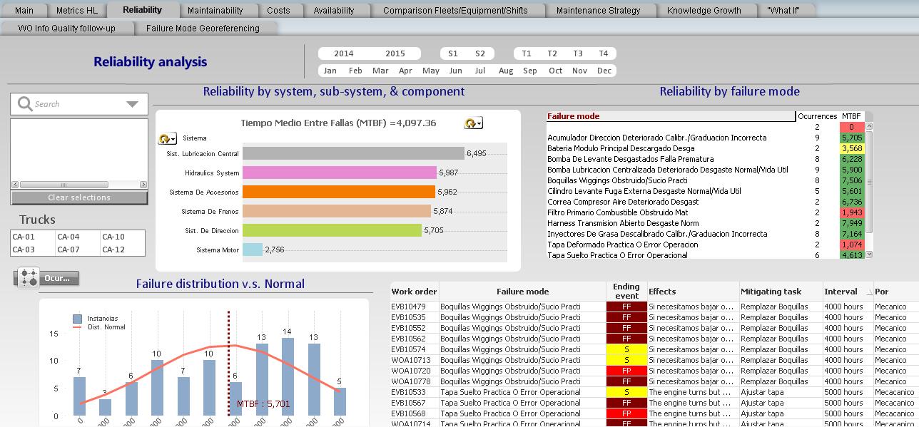
This dashboard reflects what failure and maintenance activities actually occurred. The data comes from the completed work orders that report failure modes and their ending event types, whether by failure, potential failure, or suspension.
Reliability by system, sub-system, component
Systems and component reliability
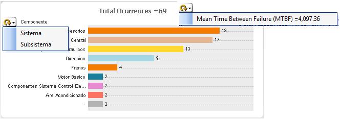 This bar chart can toggle between the number of occurrences of failure and the MTBF. Similarly it can toggle between a view of the Systems or their components. Use this chart to identify the most critical systems and components. In this view the top orange bar representing the component called “Accessories” has 18 instances of failure.
MTBF view
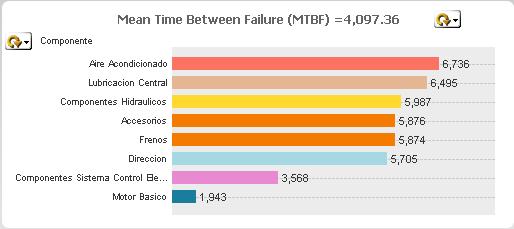 Toggling to MTBF view Accosories appears in the middle with a MTBF of 5876.
Failure modes
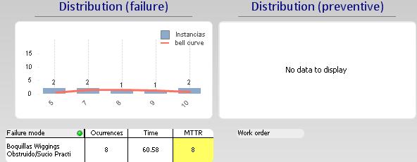
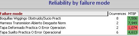 If you hit the Accessories bar in the chart, the relevant failure modes responsible for the unreliability of the Accessories component will appear in the Failure mode table. There were 8 instances of Nozzle obstruction (Boquillas Wiggins Obstrudo) with a MTBF of 7506.
Drill down from the failure mode
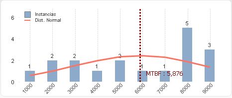 Click on the Nozzle obstruction failure mode to see a histogram describing the failure behavior of that failure mode. One nozzle failed between 0 and 1000 hours, 2 between 1000 and 2000, and so on. The MTBF is indicated as 5876.
RCM response to the failure mode
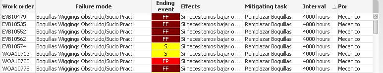 With the Nozzle obstruction as the active filter the relevant RCM strategy is displayed as well as the work order numbers, and ending event types. Hear the analyst can relate actual performance to RCM strategy and judge whether the tasks and its interval are adequate given the frequency of failure and the displayed Effects of failure.
Maintenance Strategy dashboard
 With the Nozzle obstructed filter active switch to the Maintenance Strategy dashboard. Now the entire relevant RCM analysis is displayed including the risk analysis
Maintainability dashboard
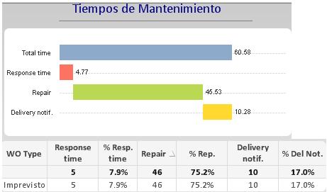 Still with the Nozzle obstructed filter active we switch to the Maintainability dashboard to examine maintenance response time related to that failure mode.
Mean time to repair (MTTR)
 The histogram of repair times is also displayed in the Maintainability Dashboard, broken down between failure and preventive event.
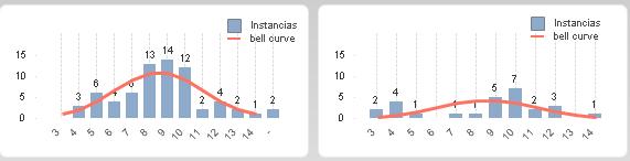
An example of repair time distributions for failure and prevention with more data available are shown below.
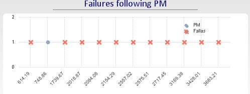
Premature failure analysis
Following a preventive maintenance action it is useful to know whether infant mortality is of concern. This chart displays the failures occurring immediately following a PM activity.
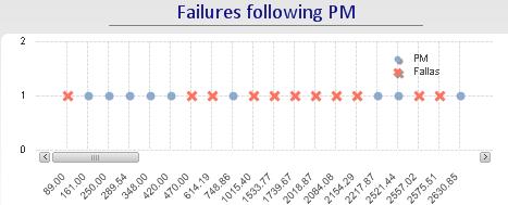
Selecting truck CA-04 and zooming into the period following PM
- [1]This way of defining failure modes differs from the RCM SAE JA1011 standard. Nevertheless, the principles of forming work packages are not affected↩
- [2]The MESH LRCM application does not include RPN but it can be added as a feature if desired. Mesh on the other hand breaks down risk into Environmental, Safety, Operational, and Cost categories.↩